

“I’ve starred in a lot of science fiction movies and, let me tell you something, climate change is not science fiction. This is a battle in the real world, it is impacting us right now.”
Are the real-life predictions of Global Warming’s effect on the Earth what we see in the Halo universe?
Something we should all be aware of in 2020, other than the possibility that literally anything could happen tomorrow and none of us will be surprised, is that global warming is something that we will all be dealing with in one form or another for centuries to come. I am not here to debate the existence of climate change or the causes, since that has been robustly shown by science over the last thirty years, so if you want to argue whether or not it is real, move along. What I am here to discuss is Halo, and more specifically what we can learn about the possibility of climate change’s effects on Earth based on the Halo lore we have gotten over the course of the last twenty years. You might not think climate change comes up much in Halo lore, and you’d be right. But we are given some potential clues, and it is those clues that I will be exploring in this article. As always, I welcome feedback, so if you think I have messed up or missed something big, let me know!
Related Media
While minor, the following article makes reference to and could potentially contain spoilers for Halo 2, Halo 3: ODST, and Halo 4


The Question JUMP TO CONCLUSION ▶
What can we learn about climate change on Earth in the 26th century, specifically how much has Earth's climate warmed and how much have sea levels risen in the past 530 years?
The Answer
It should be stated right off the bat that this analysis is highly speculative. Most of it is based off of a handful of images of New Mombasa from Halo 2 and Halo 3: ODST, which are in themselves somewhat contradictory. In addition it is unclear, even assuming the canonicity of the images, how much of the change in the images from current day imagery is due to sea level rise and how much is due to man-made terrain manipulation or some other natural event that could have affected the shore line. On top of that, climate models are just that, models, and while they are highly pedigreed and detailed, they are less accurate the further out they look. 530 years in the future is nothing on a planetary timescale, but it is an eternity on a climate model timescale.
Then, to pile on the uncertainty, we don’t have any good information on what actions human civilization took between now and the 26th century to combat climate change. A lot can happen in 500 years, and there are several scenarios that would get you to the sea level rise seen at New Mombasa. Is the temperature and sea level in 2552 still going up? Did it get much worse then start to lower at some point prior to what we see during the Battle of New Mombasa? We don’t know. Again, we will have to make some assumptions regarding this.
So with all this uncertainty, what exactly can we determine? It is still clear that there is the appearance of significant sea level rise at New Mombasa. Based on this, we can say with some certainly that global warming has or had occurred. Ultimately it is impossible to give a definitive rise in global temperatures, but we can establish a likely estimate of sea level rise along with an associated change in atmospheric temperature. What does this mean for the Halo universe? Probably not a lot, particularly when the Covenant War killed billions, including around 2 billion people just on Earth, but it is interesting to consider, and imagine what coastlines might look like on Halo’s Earth.
The Causes of Sea Level Rise
When anyone talks about climate change today, they inevitably bring up rising sea levels as a major symptom of a warming planet. But what is it that causes sea level rise? The reason that generally gets mentioned is melting glaciers, but there are actually two separate phenomenon occurring due to global warming that contribute to higher oceans. Both play a significant role, and depending on a complicated set of climate conditions, the magnitude of their effect can vary.
Melting Glaciers
The melting of glaciers and other frozen bodies of water is the most well-known and generally largest contributor to sea level rise. The water that was formerly frozen and held above the oceans on landmasses warms up, and depending on how much warming there is, some portion of that glacier turns to liquid and becomes ocean water. This process has complicated effects on the planet, including reduced salinity of the ocean locally and globally, though for the purposes of this article, we will only focus on the sea level effects.
Thermal Expansion
Remember how water expands when it warms up (and uniquely also does the same when it gets cold enough)? Well this property of water and basically every other material applies to very large bodies of water like oceans as well as a glass of water in the microwave. Warming up a glass of water a few degrees isn’t going to produce noticeable changes, but do the same to all the Earth’s oceans and you get a rise in levels of potentially dozens of meters.
For comparison, the National Oceanic and Atmospheric Administration (NOAA) has been trending sea level rise since the late 19th century (historical data), and tracking each component of the rise since the early to mid 2000s.

The cumulative effect of thermal expansion and added meltwater to the Earth’s oceans over the last twenty years. (Source: NOAA)
Based on the above chart, meltwater added to the oceans is the primary contributor to sea level rise, with thermal expansion causing a lesser but still significant rise as well. Why these two aren’t always even relative to each other has to do with several factors, including the data set itself, the location of frozen bodies on the planet, and how the added heat is applied to the surface and the atmosphere. While we tend to think about global warming as happening evenly everywhere, weather patterns can significantly shift how much of the added heat gets applied to a glacier, the air in the atmosphere, or sent into the body of the ocean. This is also why every single year isn’t necessarily hotter than the last, since we measure the temperature of the air, but the same percentage of the heat does not get applied there consistently. How does this affect our analysis? Probably not at all, but I thought it a good primer for the phenomenon we are talking about.
Expected Climate Change in the 26th Century
Before we get into the actual evidence that we will be analyzing, We should briefly look at what the real climate change data today predicts about the possibilities of climate change in the 26th century. As I said at the top, trying to predict out 530 years is going to result in a very wide range of possible outcomes, especially when you consider that the reaction of civilization to try and remedy the problem will affect the outcome, however we can at least see where the data projects sea level rise to be in the semi-near future. Again, NOAA has projections on this as well.

If you are curious why the worst-case projections seem so extreme relative the actual data we have on sea level currently, remember that sea level is based on heat of the planet, which is in turn based off greenhouse gases, and there is a delay from when the gases are released to when they cause their warming effect to when the frozen water bodies melt and raise the oceans. So while the rise so far is very modest, that is based on the greenhouse gases released years or decades ago, and our production has since ramped up considerably. Not unlike when lockdown orders were given during the initial stages of COVID, the numbers don’t look bad now, but the science predicts significant changes in the coming decades.
So considering all that, we should establish a range of likely possibilities for the climate in the 26th century before we analyze the Halo universe data. Obviously with all the uncertainties present in any kind of large-scale long-term modeling, the range is going to be quite wide, but at least it should provide us with an idea of whether what we do see is feasible, or at least will provide insight into the possible “realities” of climate change mitigation actions that could have taken place in the Halo universe. The Intergovernmental Panel on Climate Change (IPCC) has released several assessment reports on the state of Earth’s climate over the past couple decades, the most recent of which (at the time of this writing) was Assessment Report 5 from 2013. Conveniently for us, AR5 does predict out to 2500 and beyond, so we can use their findings to set our bounds for what climate change could look like in the 26th century.
Global air temperature change predictions through the year 3000, from best case (RCP 2.6) to worst (RCP 8.5). (Source: IPCC AR5 Chapter 12)
Based on these models, there is a pretty flat range of temperature and CO₂ concentration by the 2500s, though there is a lot of uncertainty in those numbers, as shown be the error bars. Using the absolute best case and worst case, the change in average global temperature will be somewhere between 0°C and 9°C, or 0°F and 16°F. That is, as expected, a huge potential range, but at least we have some numbers to go by. So what about the corresponding sea levels? The same IPCC report offers insight into that as well.
Global sea level change predictions through the year 2500, from <500 ppm CO2 to >700 ppm CO2. (Source: IPCC AR5 Chapter 13)
The data here only goes to 2500, but that is close enough to get a reasonable range of possible sea level changes. Using the data for 2500, the best case sea level rise is about 0.1 meters (0.33 feet) and 7 meters (23 feet). Again, this is a wide range of possibilities, but at least we have a potential upper bound to how high the oceans could get by the time of the Human-Covenant War.
I would be remiss if I did not at least acknowledge that these aren’t the only studies that predict sea level rise, and some other studies do show level increases beyond 7 meters, all the way to 11.5 meters (38 feet), though they weren’t included in the study due to the low confidence in the results so far into the future. I won’t get into the science of that here, but you can read more about it in the study if you like.
Global Warming in the Halo Universe
Ok, so we are finally to the point of delving into the Halo universe itself. For this analysis, I tried to find definitive evidence of a change in climate, and since outside of a direct mention of climate change itself, that is limited to physical changes to the landscape of Earth. Images on Earth in Halo aren’t exactly hard to come by, but ones that can be compared to the world today are more rare. After much sifting through images of Earth from the games and other media, I narrowed down the possibilities to a handful of images from two separate scenes. The first is the shot of North America from the final scene of Halo 4, and the second is the shots of New Mombasa from Halo 3: ODST. I’ll break these down separately, then we can see what conclusions can be drawn from this.
Example One - New Phoenix Incident, July 25th, 2557
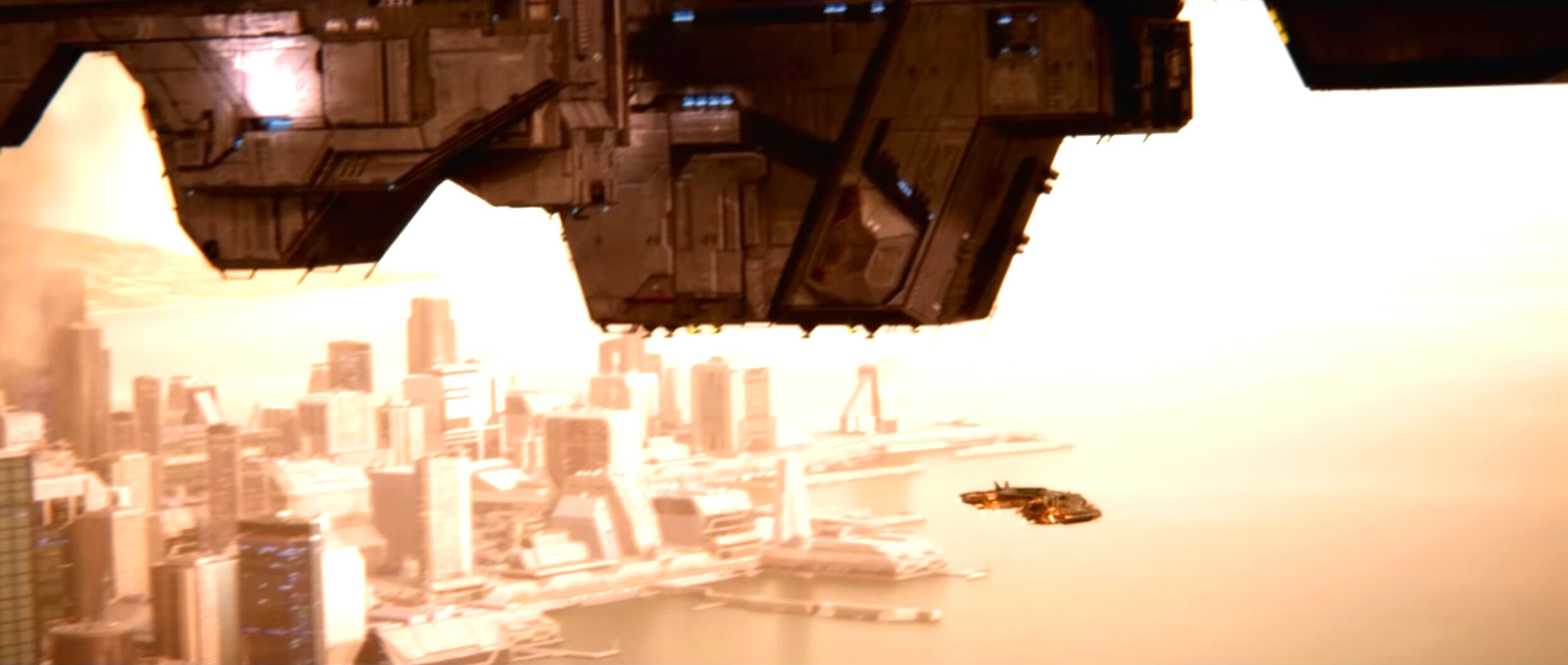
So when you try to picture all the times the actual Earth is shown in detail in any Halo media, I would guess a couple scenes pop out to you immediately. The first for me was the from the final mission in Halo 4, Midnight, where the Didact fires the Composer onto the city of New Phoenix, giving a brief, but somewhat clear shot of North America, all the way from coast to coast. If you are unfamiliar with this scene, or just need a refresh, here is the clearest shot of the Earth from that scene.
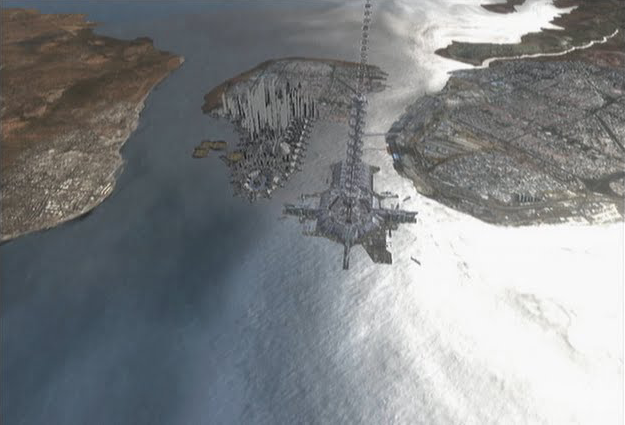
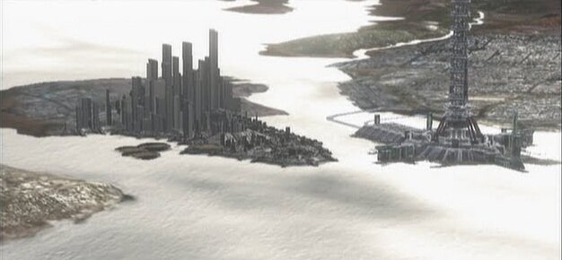
The Composer as it is about to fire from Mantle’s Approach onto New Phoenix, July 25th, 2557.
Initially I thought this was going to be a prime example of what the Earth looks like in Halo in the 26th century, and I suppose it is, but it doesn’t really help us answer our question. For one, it is a very zoomed out view of North America, making it more difficult to make out fine details. Second, the majority of the areas we are looking to analyze, the coastlines, are either obscured by weather or are in the dark, making it hard to discern exactly where the land ends and the ocean begins. Third, the one region of North America that is low enough in elevation to potentially show sea level rise from this distance, the Florida and Louisiana Gulf Coast, is blocked by the Composer.
It is actually so convenient that I wonder if this was done on purpose as to not bring up the topic of climate change at all, or to at least obscure the region so as to not confuse the casual fan who would see a changed Florida and wonder “What am I looking at?” There is just enough given to make it obvious this is North America and the United States, but too little to really allow for the lore community to come to any definitive conclusions about 26th century climate. Maybe I am being too conspiratorial, but the Composer does seem very well positioned.
For some reference, there are many resources online for showing what sea level rise will do to coastlines. I used two, the NOAA Sea Level Rise Viewer and Floodmap.net. The former is far more detailed, but only covers the United States coastline and only up to 3 m (10 ft). This is interesting, but isn’t particularly useful for our purposes. The latter doesn’t go into the same level of detail, but it covers the entire planet and lets you set the water level to whatever you like, from 0 to 10,000 m (6 mi). Using the latter and setting the sea level to +7 m (23 ft), the highest expected sea level rise by the 26th century, you can see that while there is noticeable change in coasts around the globe, the particular region shown in this scene is high enough in elevation that the general outline as seen from thousands of miles up doesn’t really change much. It isn’t until you get to sea levels well beyond what we would consider likely in 500 years that you start to see noticeable changes, and even then they aren’t as significant as other regions of the world. Looking at the Southern California / Baja California region, the peninsula shown on the west coast in the image from Halo 4 above, you can see that there is a lot of change locally, but nothing that I would consider easy to point out from this distant vantage point through cloud cover with night settling in on the west coast of the US. Here’s a comparison of the region at current day sea levels, 7 m (23 ft), and 15 m (49 ft).
The change in the coastline of the west coast of the Southwest United States and Northern Mexico. Even at over double expected sea level rise, the coastline from a zoomed-out view doesn’t change appreciably.
I think this makes it readily obvious that while there are definitely discernable changes in the coastline, it is very hard to make out those changes in the image of Earth from Halo 4 above. The general shape of the landmass doesn’t really change from this perspective, so while the reality would be mass relocation of coastline cities inland, we can’t make out those changes from this image. To contrast this with the southeast coast of the United States, there would definitely be huge changes in the coastal regions, particularly in Florida and Louisiana. For comparison, this is the difference between current day and a sea level 7 m (23 ft) above current levels.
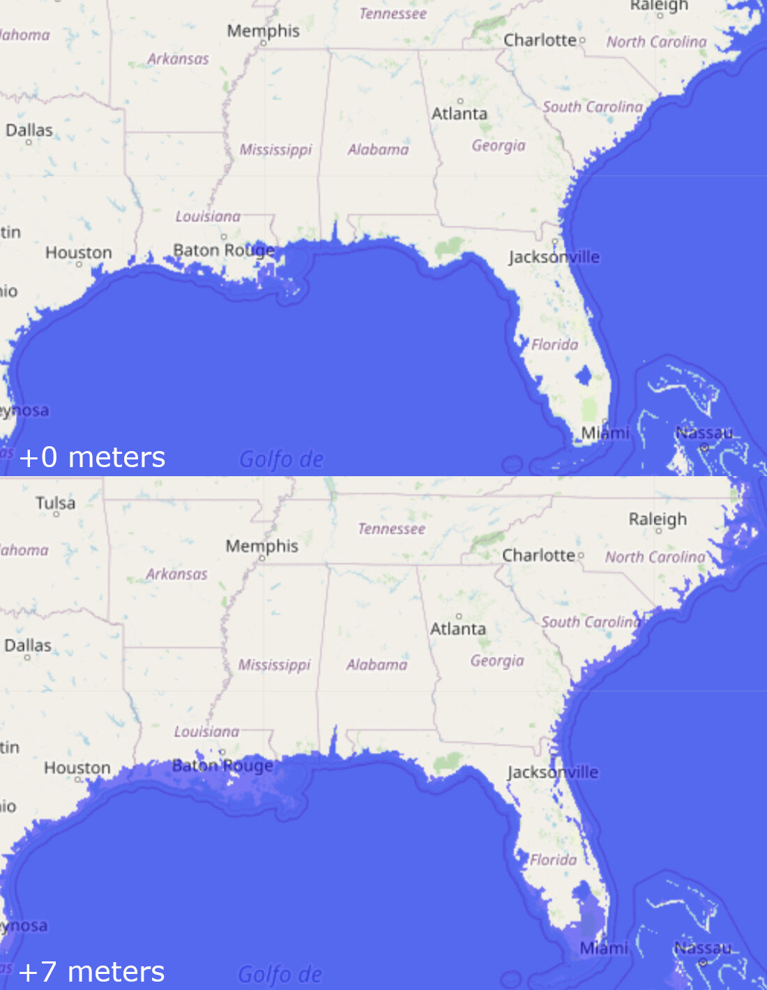
The coastline of the southeast United States would change considerably with ‘only’ 7 meters of sea level change.
Hopefully this makes it clear why I am skeptical that the blocking of the southeast region of the US is totally accidental. For one, Louisiana would lose its telltale ‘toe’ entirely, and Lake Okeechobee would become part of the Gulf of Mexico. The Florida Keys would be gone, and the Caribbean Islands would be forever changed. This would be immediately noticeable had the Composer not been blocking this region, and we could definitively say how bad climate change had gotten. But, alas, we don’t have a clear image of a coastline from Halo 4, and we can’t make any definitive conclusions about climate change in the United States, other than perhaps that it did not get wildly worse than even the worst-case models predict.
I do want to point out, however, that this shot takes place in the middle of summer in the Northern Hemisphere, and yet the entire state of Michigan, as well as several other northern states and Canada, are blanketed in snow. That is very odd. Even today that would be very abnormal. So what gives here? Surely global warming would make average snowfall less, not more. Part of me wants to chalk this up to the climate getting thrown wildly out of whack do to unmitigated CO₂ release, but this doesn’t seem very plausible. Were it a freak storm later in the spring, sure, maybe, but this is in the middle of July. I just don’t see a large-scale snowstorm in the middle of the summer to be a plausible scenario no matter what changes to the climate occur. So then how do we explain this?

The Little Ice Age was a period that lasted around 200 years that was noticeably cooler than periods prior. One possible cause is increased volcanic activity, though the evidence is not conclusive.
My first thought is, of course, that this is just an error and we shouldn’t consider this image strictly canonical. Perhaps Halo 4’s campaign was originally planned to take place in the winter months (for the Northern Hemisphere) and there wasn’t time to change this part of the game. Maybe it was just an oversight and no one noticed the image doesn’t match the seasons. This type of minor canonical error has occurred before, and if you read up on this level in Halopedia, it is noted that the terminator, the line demarking night and day, is angled such that this image should take place in the winter. So this seems like the most likely explanation.
But I do have one other theory, that is probably wrong, but it is interesting to think about. We know that prior to 2552, the Earth was free from global-scale warfare, at least as far as we know in the lore. But the Covenant attack in 2552 would have been an incredible event, one that resulted in around 2 billion deaths. We know at least a portion of the continent of Africa was glassed, including the area around the Portal at Voi. This glassing, while only occurring in a relatively small area, would have kicked up an incredible amount of dust into the atmosphere. We also know from recent historical data that the planet has experienced cooling events during major volcanic activity, which similarly emits a lot of ash and sulfuric acid, blocking the sun and lowering the overall temperature of the planet for the following year or two. Five years would be a long time for the planet to remain cooled enough to cause snowstorms in July, and temperatures would have to lower a considerable amount, up to 15°C (27°F) to cause this kind of weather, but depending on the full extent of the damage done from the Battle for Earth, this isn’t completely out of the question.
Analysis of Data
From the perspective of shorelines, there is not sufficient data in this image to make any firm conclusions. The view is just too far away, the image is too obscured, and key regions are blocked from view. Additionally, there is the issue of the snow and implied time of year. As far as I am concerned, this discrepancy is just an oversight by 343 Industries, especially when you consider the evidence points to this event taking place in the winter, despite it canonically occurring in July. While there is potentially a lot of data to take out of this image on the state of Earth in 2557, there are too many questions in my mind to seriously consider anything to be strictly canon. I would say that anything you see here should be considered loosely canon, unless there is evidence to support or refute it. This is one of the rare instances I think where game canon should not trump other sources.
Example Two - Battle of New Mombasa, October 20th, 2552
Our second piece of climate change evidence in the Halo universe is from the Battle of New Mombasa, which occurred primarily on October 20th, 2552. Because this battle was featured for 2 full missions in Halo 2 and the entirety of Halo 3: ODST, we actually have quite a lot of detail on the city of New Mombasa including its layout, city design, and waterways. As you can imagine, the waterways is what we will be focusing primarily on for this analysis. Also, since there is some contradictory information about the city layout between Halo 2 and Halo 3: ODST, I will primarily be relying on what we are provided by Halo 3: ODST, since it is both newer and features New Mombasa more prominently. Because we have a lot of reference shots of New Mombasa from Halo 2, Halo 3: ODST, and Halo 2: Anniversary, lets quickly go through them to get a firm image of the city in our minds.

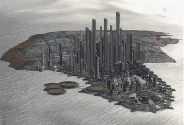
As it can be seen from the series of images from the Halo 2: Anniversary cutscenes, it seems like Blur made an attempt to reconcile the design of New Mombasa for Halo 2 with the design from Halo 3: ODST, though with the camera angles being so extreme and the shots moving very quickly, it is hard to tell if they really did or if it is just the angles obscuring the city’s layout. Either way, I will say it is super weird that the landmass northeast of the Mombasa Island appears uninhabited in Halo 2, and on top of that contains a mountain range that definitely doesn’t exist in Halo 3: ODST or in real life. Like I said before, since Halo 3: ODST is both newer and takes place entirely within the city of New Mombasa, I am using that design as canon, and assuming the Halo 2 depictions are not entirely accurate.
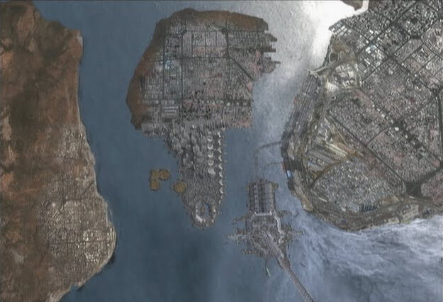
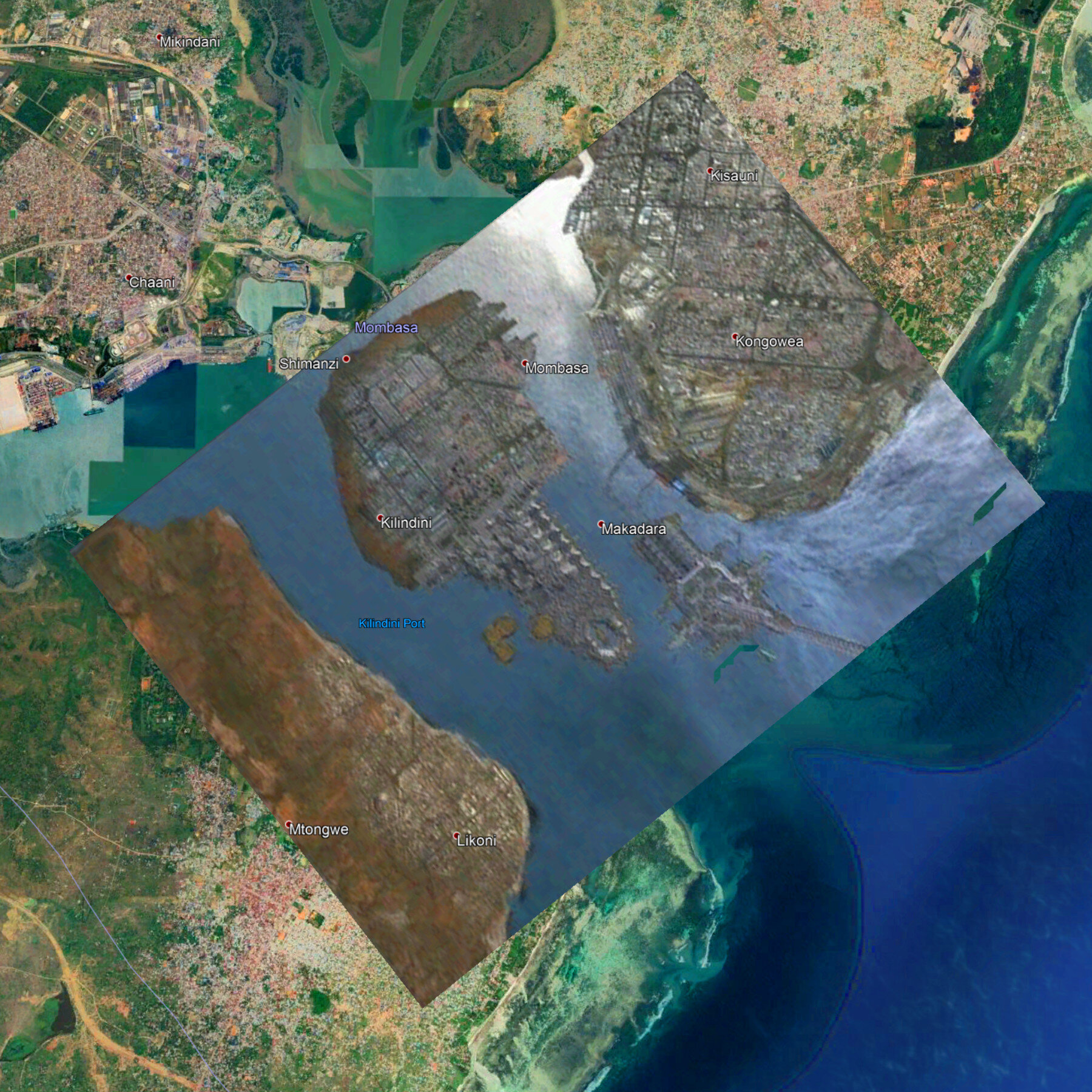
So now that we have established which New Mombasa is New Mombasa so-to-speak, we need to compare the New Mombasa of 2552 with the Mombasa of 2020. Using Google Earth, I overlayed the best available overhead image of New Mombasa on top of the real-life map of Mombasa, doing my best to fit the layout of New Mombasa from Halo 3: ODST with what actually exists today. Without a ton of clear landmarks it is hard to say for sure that this is the ‘correct’ overlay, but I think it matches the landmarks well enough to say this is close enough to ‘actual’ to do a decent analysis on.
Rising to the Challenge
Because the New Mombasa layout is so much different than what we know Mombasa looks like today, it was difficult to orient and size the overhead we have to fit in a reasonable way. Since we are assuming there is some sea level rise too, the coastlines would have changed wildly even without any manmade changes to the landscape, making lining up with that edge impossible. In the end I scaled the image so both landmasses on either side of the island were in approximately the same location as current day, and fit the island so that it was contained within the present-day Mombasa island. Even so, there was a lot of wiggle room for interpretation, so I used the waterway seen at the top right of the New Mombasa overhead (top middle for the image above) to line up with the smaller waterway that exists there today. This seemed to make logical sense, and I assume that was the original inspiration for that part of the New Mombasa design.
Now that the old and new maps are lined up, we can start to make some general conclusions about the changes in topography that happened over the 530 years. First and foremost, it is pretty clear the water level in 2552 is noticeably higher than it is in 2020. The island is considerably smaller, the harbor on either side of the island are larger, and the ocean-facing shoreline has receded back several feet. With this information, we can now start to make some conclusions about the sea level rise in this part of the Indian Ocean, which can be generally extrapolated to sea level on the rest of the planet.
One other thing to note before we come up with some actual numbers is that the land the city sits on has obviously been heavily manipulated. While there are parts of the landmass that are now underwater in 2552, there are also parts of the harbor that are now land. To only way to account for this is if the harbor was artificially changed, either for flooding concerns or commerce. The same goes for the island the tether sits on, which does not exist at all today. This must have been made sometime in the future, probably for the construction of the tether itself.
And finally, while we are talking about climate change as it relates to sea level rise, other parts of the climate are also affected. This includes weather patterns, average rainfall, and average temperature, which would have their own affect of the flow of the streams and rivers into the harbor and then ocean. Just an increase in average rainfall would change the path and depth of the rivers, sea level rise aside. Because of these other confounding factors, I think it is best to limit our estimation on sea level rise to the two 'elbows’ on the primary landmasses facing the ocean. These changes would be least affected by any other changes upstream, and appear to be mostly untouched by artificial manipulation.
To gather data, I looked at various points along the new coastline and used the elevation data from Google Earth to determine what the elevation used to be at this point. It isn’t a great method, since any artificial manipulation to either raise or lower it would invalidate the data, but since we don’t really know what parts were terraformed and what parts were left alone, it is really all we have. Again, since my assumption is that there would be less changes needed for the coastlines touching the Indian Ocean, and more for those inland, I focused primarily on the former (red dots). I did collect the data for the other areas as well (yellow and orange dots), but those should be looked at with a high degree of skepticism.
Map of Mombasa with the overhead shot of New Mombasa overlayed. A dot represents an area where I sampled the current (2020) elevation, corresponding to part of the 2552-era shoreline. Red dots are considered to correspond more closely to 2552 sea level rise. Orange and yellow dots are considered less likely to be representative of sea level rise and more to do with artificial terraforming or other climate impacts.
It is readily apparent from this that for the 2552 overhead view of New Mombasa to be totally realistic, there would have to be a lot of terraforming done to the entire region to make this make sense. If the above map is a little confusing, I’ll try to explain a bit. Given that we don’t know which areas were left natural or were manipulated artificially, we have to assume either is possible. If the sea levels had risen 7 meters, any dot on this map above 7m would had to have its land removed, and any dot lower than 7m would had to have had land added to raise up the shoreline to keep the water at bay. Since we are dealing with several overlapping uncertainties, from terraforming to non-sea level climate effects to the correct positioning of the overlay itself, this leaves a metric shit-ton of possible ‘correct’ answers.
I think it is less likely that the shoreline facing the ocean was terraformed versus the shoreline of Kilindini Harbour, but honestly that is just an educated guess. If we assume this, however, and filter out the data from the harbor and the ‘elbow’ area connecting them to the ocean, our range of potential sea levels goes down considerably. If you also account for the fact that the northern region is much more populated than the southern region, it is even more likely that little to no terraforming was done on the southern-most data points, whereas a seawall could realistically have been built on the northern region to keep a rising ocean away.
Considering all this, we are still making a guess as to the sea level rise seen at New Mombasa, but I think it is a much more educated guess, and one I would consider very plausible given the data. Based on the remaining data, it appears that sea level has risen between 10 and 12 meters, and given the amount of uncertainly that still exists, I would expand that to between 7 and 15 meters. Still a decent amount of error in those numbers, but it gets in the ballpark of the state of the climate in the 26th century.
Our Data is Eroding
For the sake of argument, and since I always default to the lore whenever possible, we should place a great deal of consideration to factors other than sea level rise, especially since the data seems so unbelievable in terms of the sheer scale of the level of Earth’s oceans. We already chose to ignore the sea level data for the harbor and entire area surrounding Mombasa Island because there were too many confounding factors, particularly from possible terraforming and other climate changes. That only left us with the data points that are less likely to have experienced other changes that could have affected the shoreline of 2552. Based on this alone, sea levels would likely have risen around 10 m (33 ft), a staggering amount.
But one thing we failed to consider was erosion. Erosion, and its opposite, accretion, are happening constantly all over the world, to just about every shoreline that we know. This has no bearing on actual sea level rise, but it would affect our results, because we are only considering where the shorelines appear in the images and what the elevation is at that point of the map in 2020. Given hundreds of years, shorelines shrink and grow, and unless people stepped in to stop the erosion through artificial processes, the adjusted shoreline we are looking at in Halo 3: ODST could very well be caused by erosion as much as ocean levels.
Looking into erosion further, the data seems to support that this is a real possibility. A paper published in Nature in 2018 shows that the region we are studying is experiencing significant erosion, at the rate of up to several meters per year. Given 530 years of time between now and 2552, significant erosion could have taken place. In fact, looking at the map overlay again, the distance between the current shore and the shoreline of 2552 is between 350 and 500 meters. While an erosion rate of a meter per year is unsustainable with sea levels remaining constant, rising levels would make erosion worse, potentially exacerbating the erosion rate and assisting in moving the coastline further inland that would have otherwise been possible.

Shore erosion based on location, as well as longitude and latitude. The region of Mombasa on the east coast of Africa, around 20°S 40°E, is currently experiencing significant erosion. (Source: Nature: The State of the World’s Beaches)
So what does that mean for our analysis? Well it adds another potential factor to consider, and one we can’t easily calculate. We know it is happening now, and we know it is likely to happen in the future. We also know that sea level rise can affect the level of erosion, though by how much is not really known. But we can use it to determine some potential bounds on our data, which should help to determine a new minimum sea level rise, given a worst-case erosion scenario.
Looking into normal slopes of beaches, our slope would have to be between 0.5° and 11°. Based on Google Earth, the slope of the beach on the east coast of the landmass south of Mombasa island is about 3°. Extrapolating this out from the current shore to the new shore shown in Halo 3: ODST, however, would result in a beach elevation higher than the current elevation at that location. That obviously isn’t possible, so we will have to make our own estimate for the slope of the shore. If we were to use a low-end number of around 1° slope, and assume that erosion wore down the shore all the way from the current day location to the 2552 location, the elevation at the location of the 2552 shore would be between 6 m (350m inland) to 8 m (500m inland). Using the absolute shallowest reasonable slope of 0.5°, the numbers change to around 3 m (350m inland) to 5 m (500m inland).
I know I just threw a lot of numbers out there, but we now know a couple new things. First, the absolute worst-case sea level rise at this location, assuming no terraforming, is 12 m (39 ft) with no erosion. The absolute best-case rise, meanwhile, again assuming no terraforming, is 3 m (10 ft). I don’t think either is very reasonable given wheat we have seen above in regards to worst case sea level rise or beach geography. The most likely scenario, assuming significant erosion, a shallow but reasonable beach slope, and the distance from the current shore to the shore in 2552, is around 7 m (23 ft). I realize there are still a lot of factors at play here that could potentially make the answer almost anything we wanted, but 7 m is a good estimate that isn’t unbelievably drastic, and takes all factors into account. Without additional information available, this is the best estimate we have that fits all available data.
Analysis
While we did not get any useful data out of the first example, the shot of North America from Mantle’s Approach in July 2557, we got almost too much data from the overhead view of New Mombasa from October 2552. Still, we came to the conclusion that the sea level rose around 7 m (23 ft) in the Halo universe. No matter how you slice it, this is really bad. The worst case scenario from the IPCC AR5 report in 2013 showed up to a 7 m rise in sea levels by the 26th century, which corresponds to a CO₂ level around 1500 parts per million (ppm), over 3 times more than today’s levels, and over 5 times more than the start of the industrial age. This would then correspond to around a 6°C (11°F) increase in average global temperatures, a level that indicates either a nearly uncontrolled release of greenhouse gases into the atmosphere or a climate that behaved far worse than models predicted. Either way, this is very bad for the ecosystem, and the Holocene extinction that we are currently in would likely result in the loss of most of the biodiversity on the entire planet.
Using what we know about climate today, what the climate models show, and what we predict the sea level rise to be in 2552, we can estimate the trend that CO₂ concentration, average global temperature, and sea levels would have taken in the Halo universe. Using the date provided by the IPCC AR5 and our estimate of 7 m of sea level rise, here are the best guess trends of what would have happened to the climate from today through the Interplanetary War (2164-2170), the Domus Diaspora (2362-2390), and the Human-Covenant War (2525-2552).
CO2 Concentration by Century (Halo Universe Estimate)
Sea Level Rise by Century (Halo Universe Estimate)
Average Global Atmospheric Temperature Change (Halo Universe Estimate)
Knowing this, we can make some interesting predictions about the Earth in the 26th century, at least up until the Battle for Earth in 2552. As I mentioned earlier, there seems to be some evidence that the Covenant attack on Earth could have caused a short-term global cooling due to the dust and debris kicked up into the atmosphere, though the evidence for that is highly speculative. What we do predict, however, is that by 2552, it would be around 6°C (11°F) hotter on average, resulting in more energetic storms on average, and far less snow and ice coverage worldwide. The Greenland ice sheet would likely be significantly reduced, and sea levels would be, on average, 7 m (23 ft) higher. This means that the landmasses of Earth would look a bit different than they do today, barring human intervention such as terraforming, sea walls, or other water incursion prevention techniques. Taking a sampling of the current planet and raising the sea levels, here are some image of what the countries and continents of Earth could look like in the 2500s.
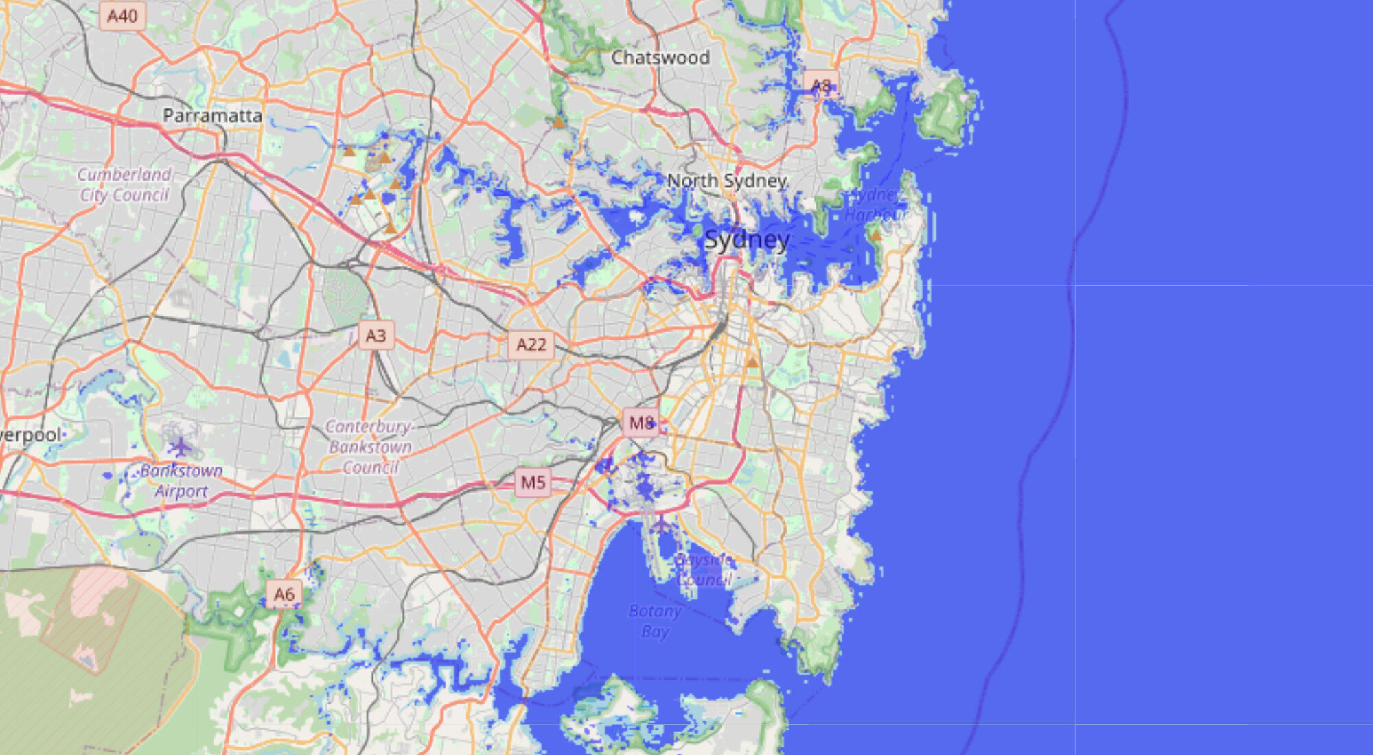
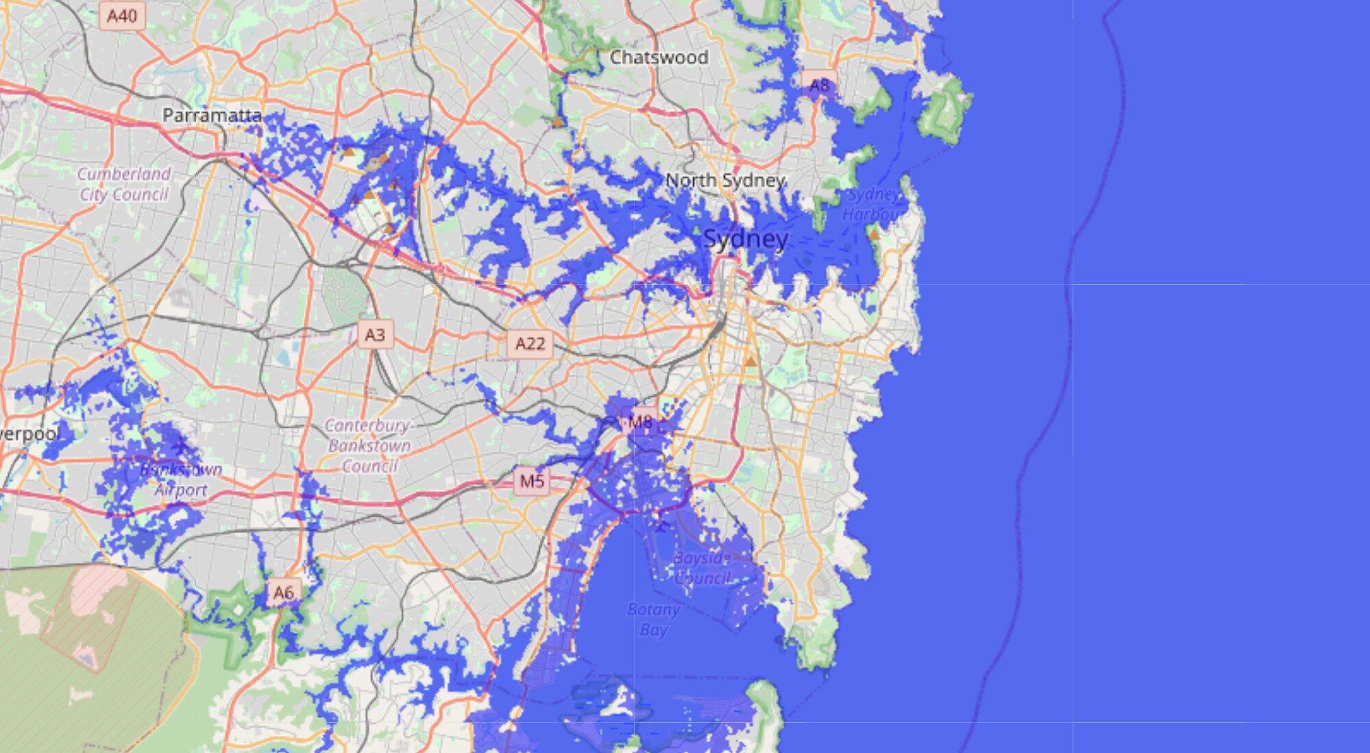
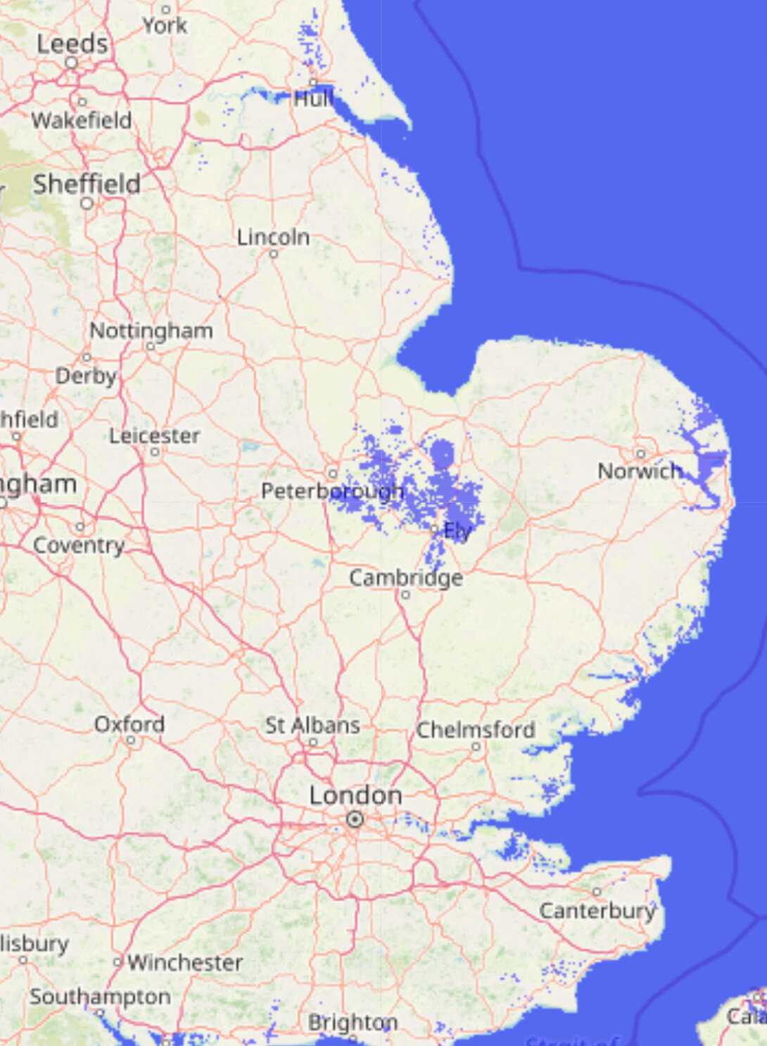
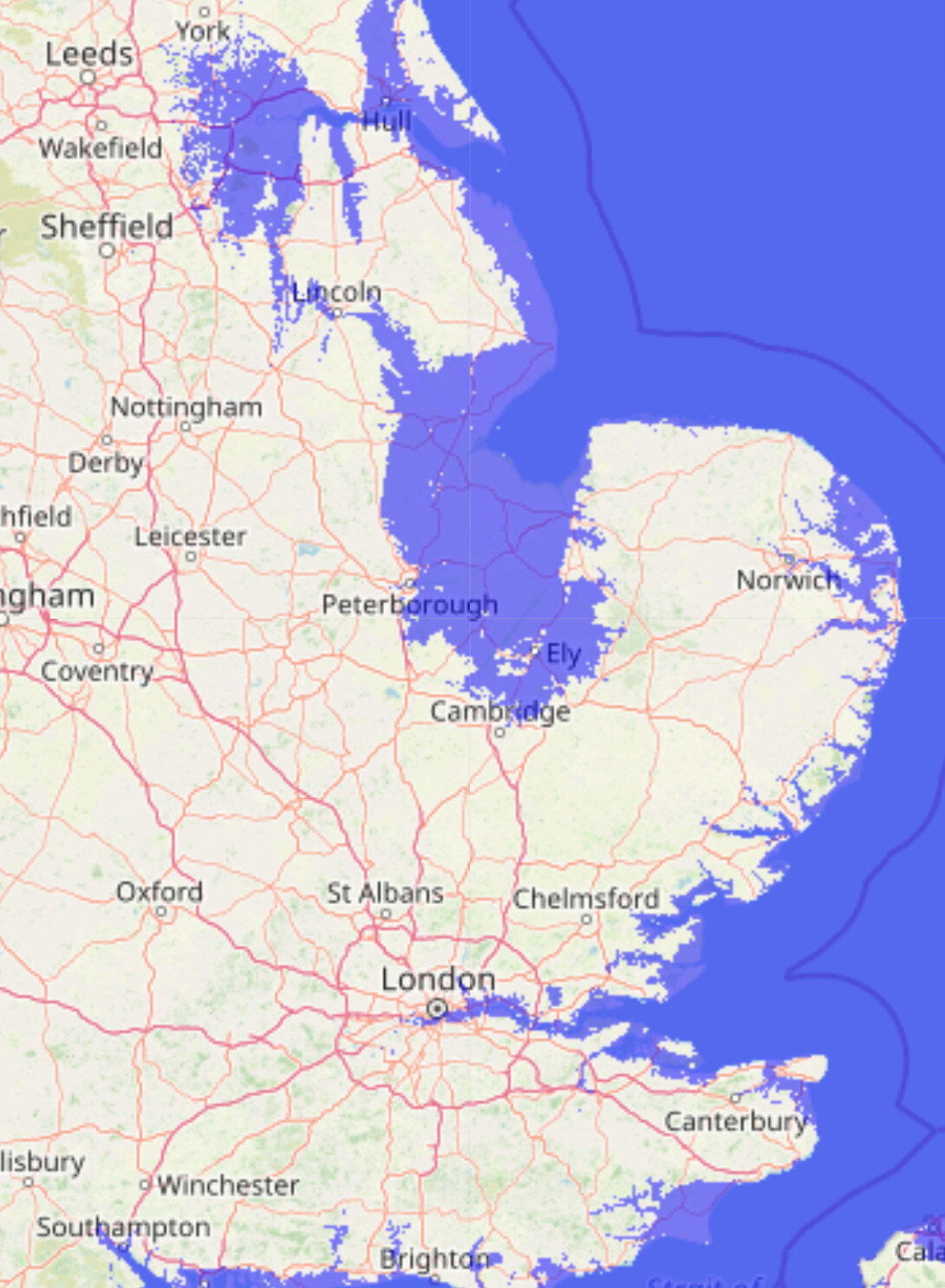
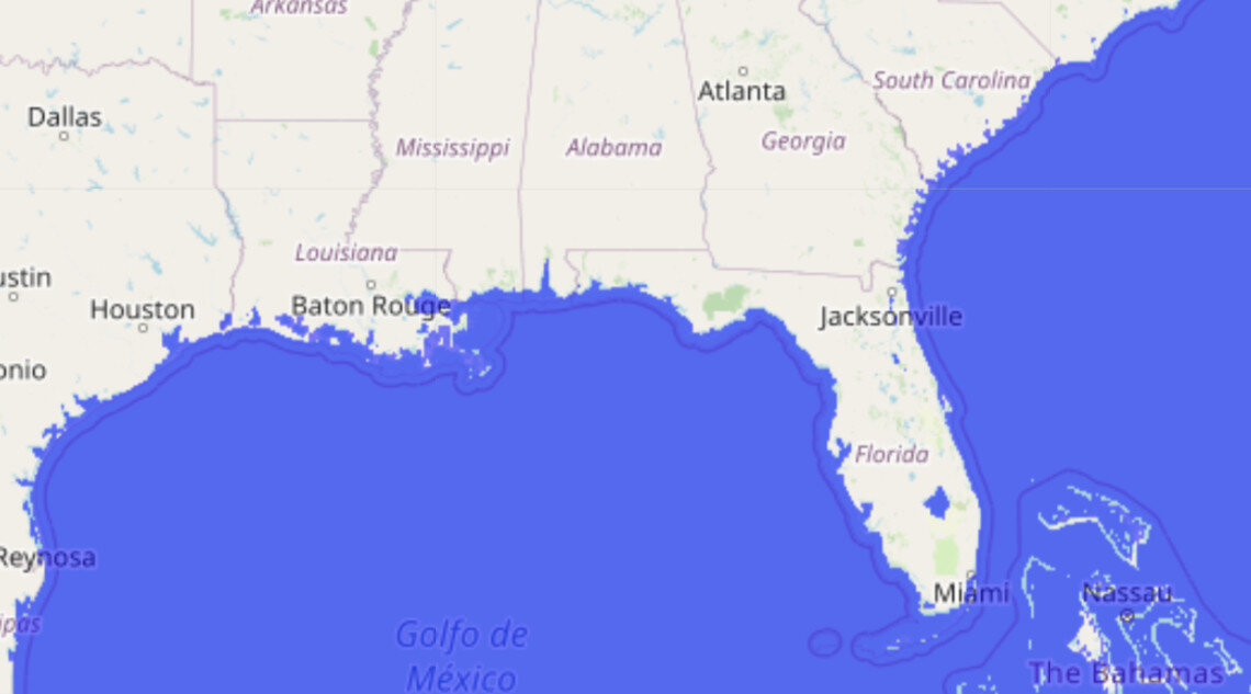
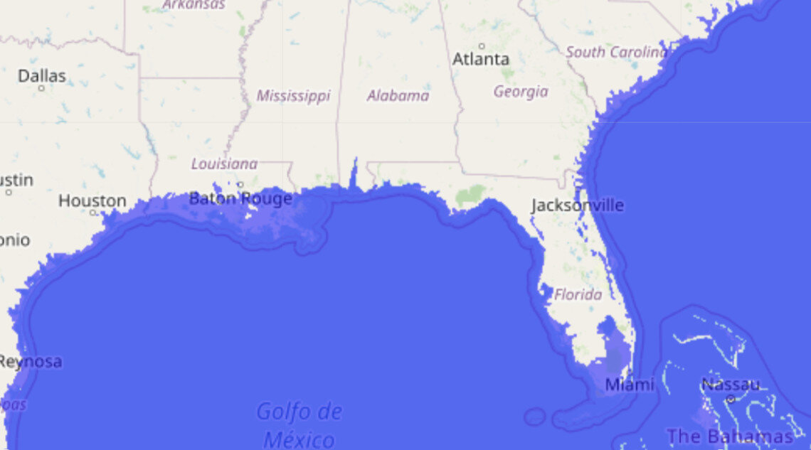
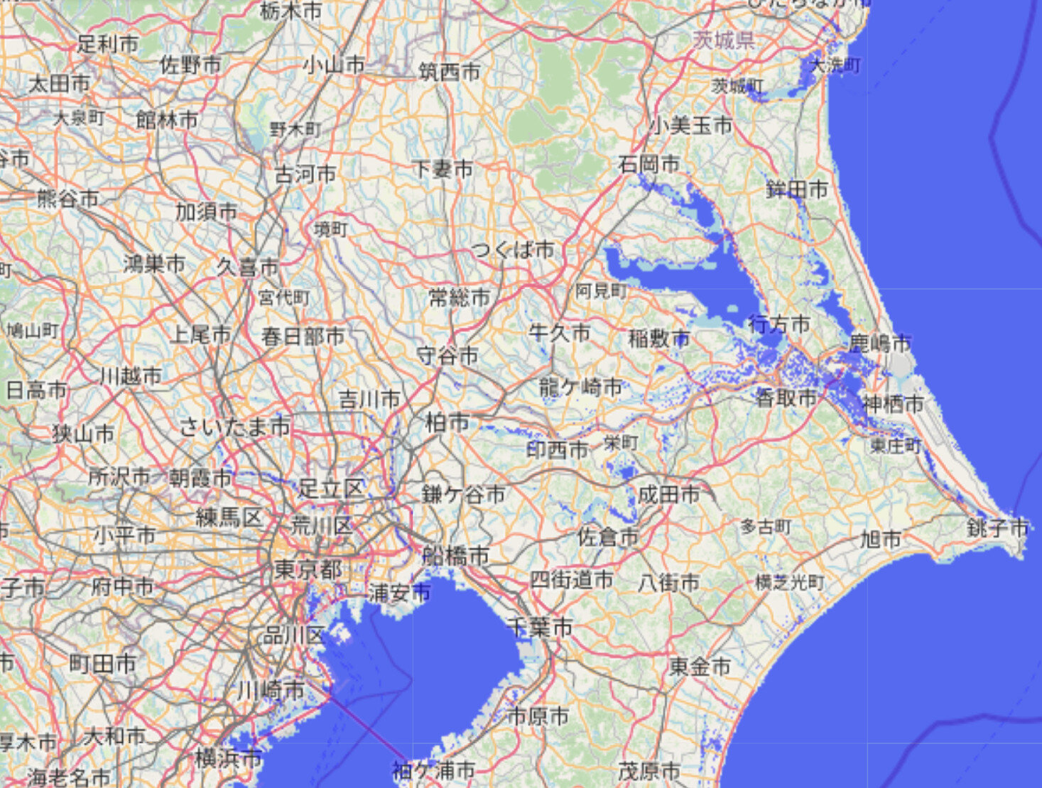
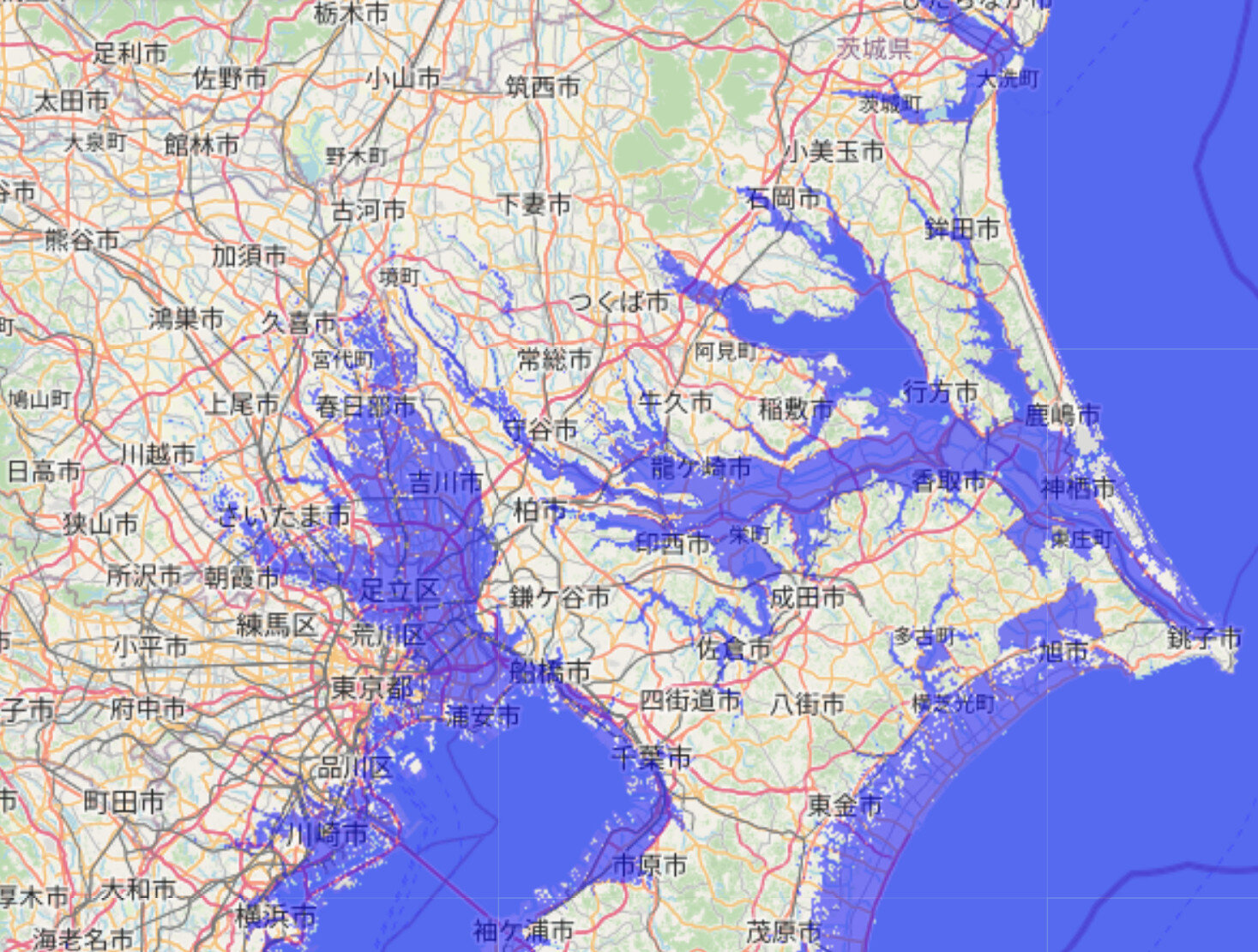
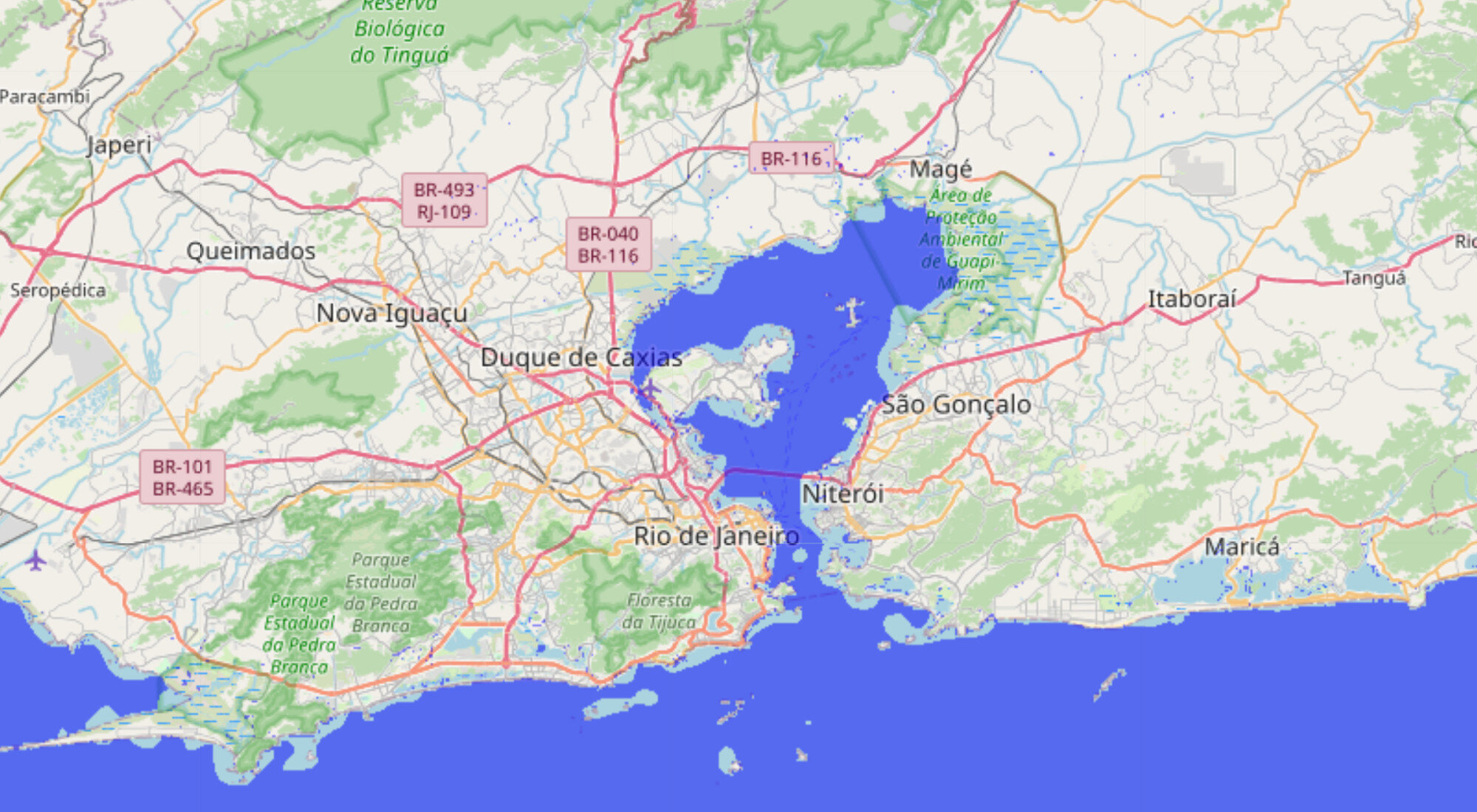
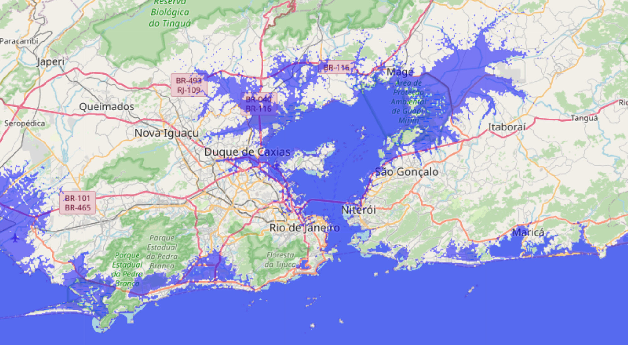
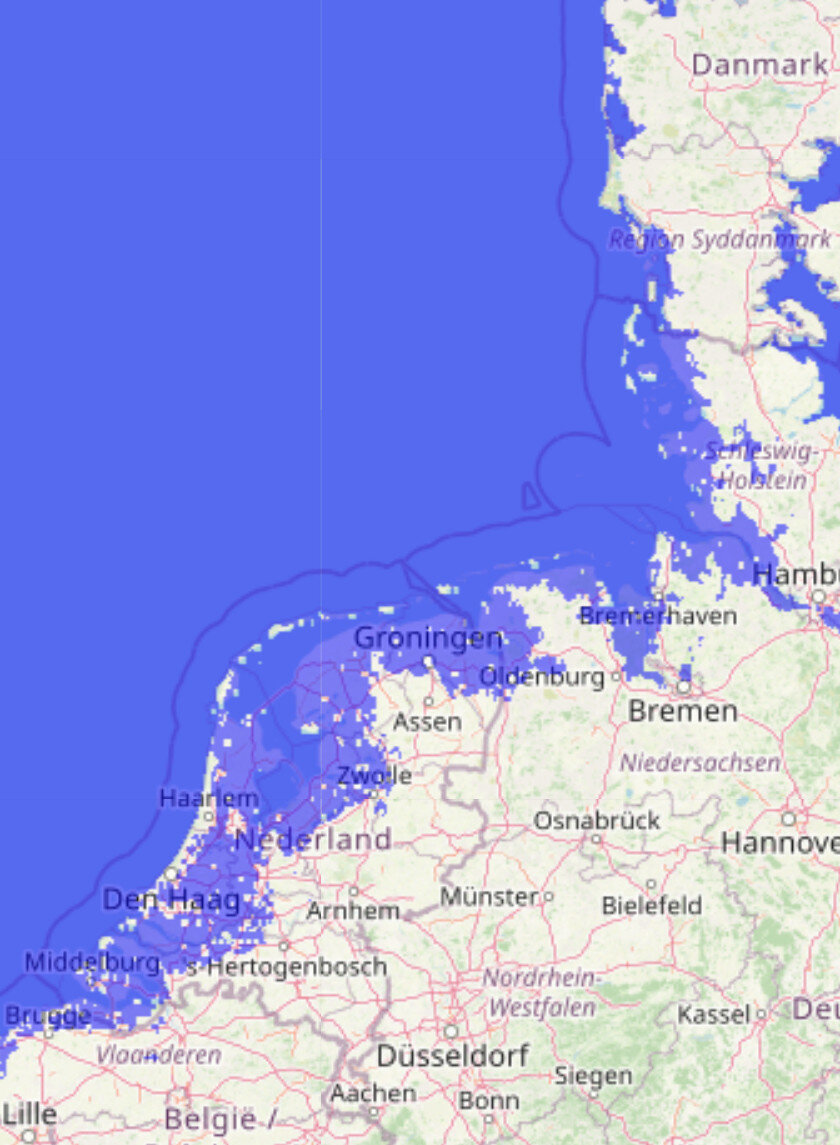
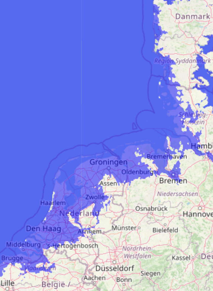
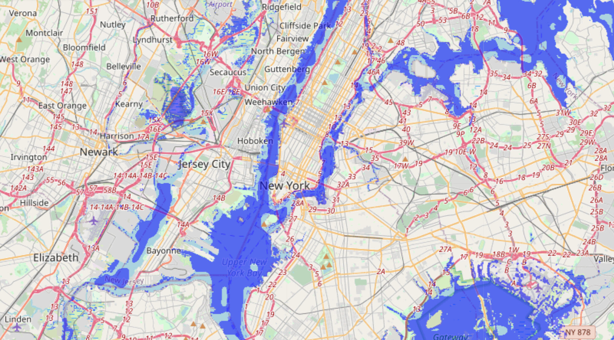
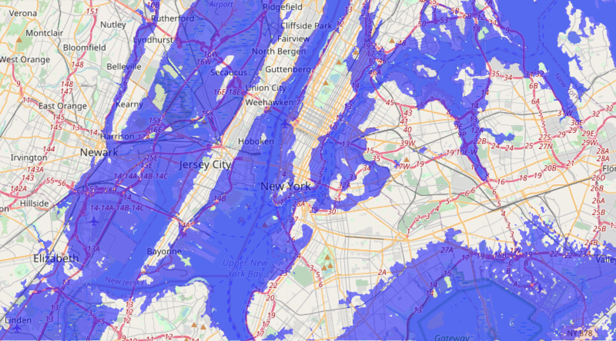
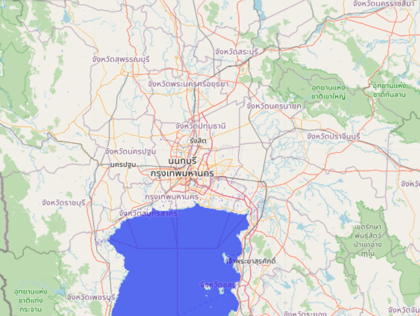
While this is only a handful of regions of the planet, it is apparent that there would be significant changes that would need to be made to cities and the places where people lived. For cities, sea walls could probably keep water out of the majority of areas, though some cities would have an easier time than others based on their elevation and topography. For larger regions like the Florida Keys, the southern tip of Florida, and the southern “toe” of Louisiana, people would probably just have to move. That isn’t saying it isn’t possible to build a sea wall potentially hundreds of kilometers or miles long, but realistically it wouldn’t be cost effective. For large cities, a relatively short sea wall of tens of kilometers would be easier to justify, and easier to build. New Orleans does exist within the flooded region of Louisiana, but considering how many issues the city already has with water levels, I find it hard to imagine that it would continue in the face of rapidly rising water levels. Nothing is outside the realm of possibility here, especially when you are talking about 26th century humanity with faster-than-light travel and exoplanetary terraforming capabilities, but that is just my personal opinion given the available data.
One last thing to point out is that the predicted sea level rise shows it continuing to increase beyond the 26th century. Since there is a significant delay between atmospheric warming and sea level rise, it isn’t done yet. I don’t have data beyond 2500 to make an educated guess on where the sea levels might end up with a climate warmed by 6°C, but we can look at the large ice sheets on the planet and see how much water they hold. It is estimated that the Greenland ice sheet holds 2,850,000 km³ (684,000 mi³) of ice, which. if all melted, would raise the sea levels around 7.2 m (24 ft). The Antarctic ice sheet meanwhile is estimated to contain 26,500,000 km³ (6,400,000 mi³) of ice, or 58 m (190 ft) of sea level rise if all melted. Obviously the estimated rise is nowhere near melting all the ice sheets, but that means there is potentially a ways to go before reaching equilibrium level with the given atmospheric temperatures. Where the levels stabilize would just be a guess, but I don’t think doubling of the estimated rise to around 15 m (49 ft). is out of the question.
Conclusion
After analyzing the circumstantial evidence available for climate change in the Halo universe, there are no absolutely firm set-in-lore conclusions we can make. Due to the various discrepancies with the entire visual of North America from space at the end of Halo 4, that evidence is not useful for this analysis. The only other data that we have that provides any clues to the climate in the 2500s is New Mombasa from Halo 2 and Halo 3: ODST. While the evidence is far from conclusive, using some reasonable estimates and sensible assumptions, we can estimate that the Earth’s sea levels have risen approximately 7 m (23 ft) from today’s levels. Using the most recent available climate models to predict how the climate would have had to have behaved between today and 2552 to get to that point, we can estimate that CO₂ levels in the atmosphere are likely around 1500 ppm, and the average global atmospheric temperatures are around 6°C (11°F) higher than today.
Using this data to estimate what the human actions would have had to have been to produce these results, we get a response to climate change that is basically the worst assumed possible, delaying action for decades before finally cleaning up our act. Either that, or the reality is actually worse than the models predict. Most of my data is from a report that was published in 2013, using data from years prior, so while relatively recent, it doesn’t incorporate what we have learned since then. There is another IPCC report scheduled to be published in 2022, so that should have additional data and better modeling, meaning maybe this scenario isn’t the worst case after all. Not that it makes it any better, but modeling out that many years adds a lot of uncertainty, so it is just very hard to say with any confidence what exactly will happen between now and the 26th century.
As I have mentioned several times in the body of this article, we are making a lot of assumptions when trying to determine an answer. That isn’t to say that the assumptions we made aren’t reasonable ones, but from a lore perspective, basically any answer could be sufficiently supported by the data to call it canon. This is, in my opinion, the answer that best fits the real-life scientific data and the in-universe lore data we have been provided. If 343 Industries came out tomorrow and said global warming in the Halo universe is effectively non-existent, I can find enough uncertainty in what I analyzed above to make that work. But until that day, I will use the data at hand as best I can to determine the most likely answer, and that is that the climate has warmed 6°C, CO₂ in the atmosphere is around 1500 ppm, and the sea levels have risen around 7 m.